Offering multiple solutions, developing the best design strategy for your needs, drawing custom details applicable to your project, obtaining all required permits, assisting with contractor bids, & observing construction are a just a portion of the services offered at Claudio Studio Architects.
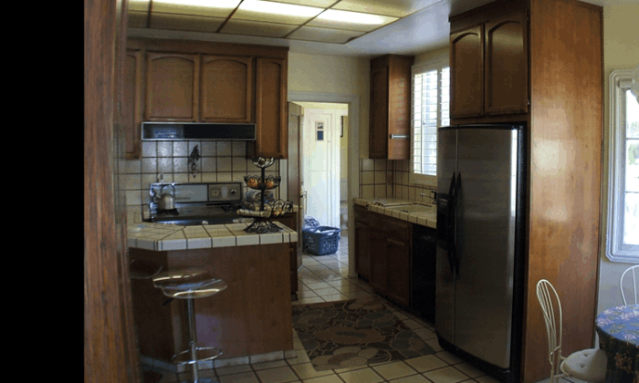
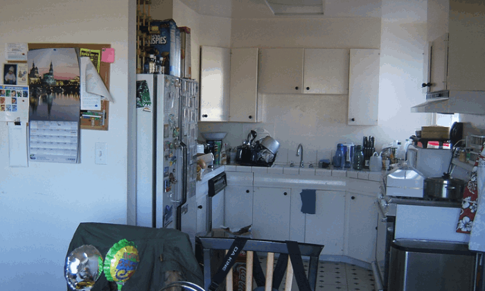
Dark and dated, the kitchen was split in two by the door to the laundry room that led to the only door to the back yard. A peninsula further bisected the kitchen into cramped, unusable spaces where residents had to squeeze by each other.
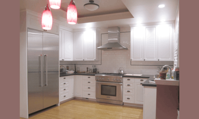
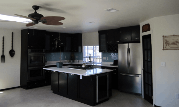
Relocating the door created a continuous more useable counter which allowed for the removal of the peninsula. Now multiple residents can easily navigate between the refrigerator, range and sink without bumping into others being stationary at the counter.
Home Office
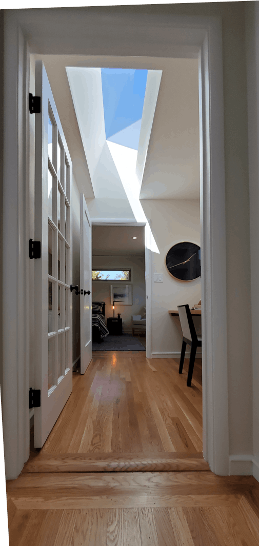
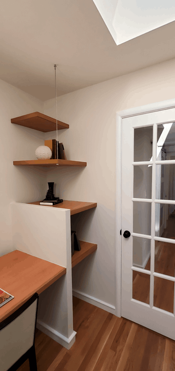
With space at a premium, the footprint did not allow for an office room. Creating an office alcove in the rear hallway that does not get much foot traffic became the perfect location.
Home Office
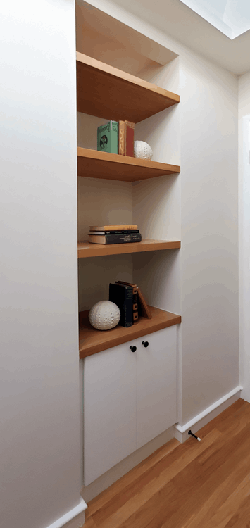
Built in shelves and storage provide more usable floor space and leave the desk clear of clutter.
Home Office
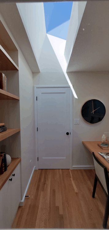
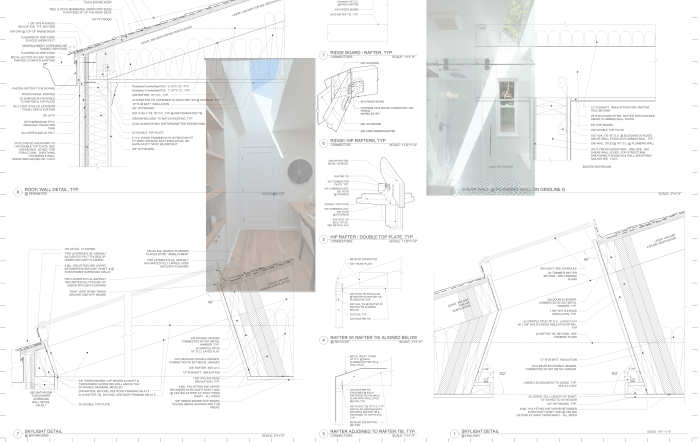
The shape and size of the skylight specifically designed for this office space brings in diffuse light to reduce screen glare and make the office feel larger with the increased ceiling height.
Home Office
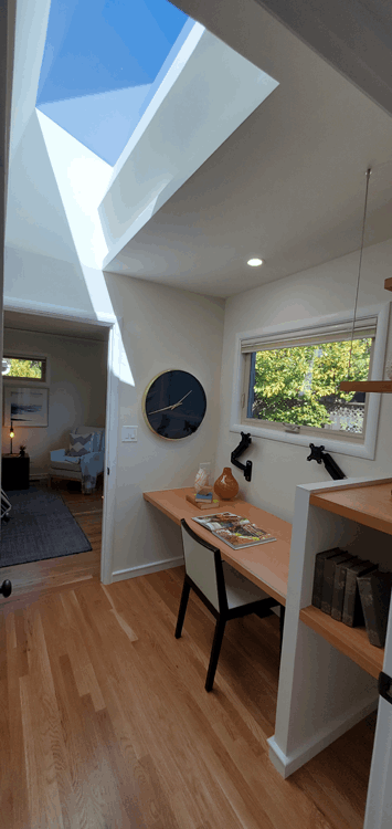
The built in floating desk increases floor space for more leg room and versatile seating options.
Home Office
Built in and floating shelves with multiple outlets are conveniently located next to the desk for additional office equipment.
Master Bathroom
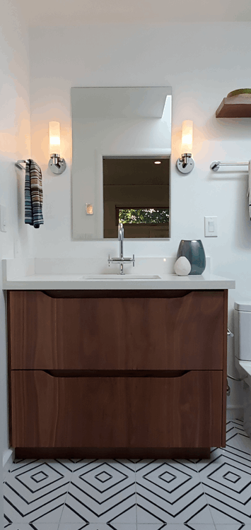
Warm wood vanity compliments the cool, clean tones of the patterned floor tile and wall tile. Two light sconces provide ample illumination at the vanity.
Master Bathroom
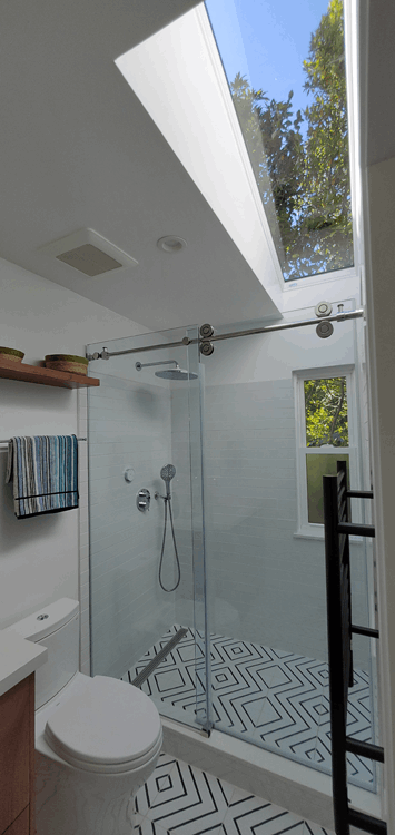
The skylight, clear glass door, the patterned tile continuing into the shower provide the illusion of a much larger space for this economically sized bathroom.
Master Bathroom
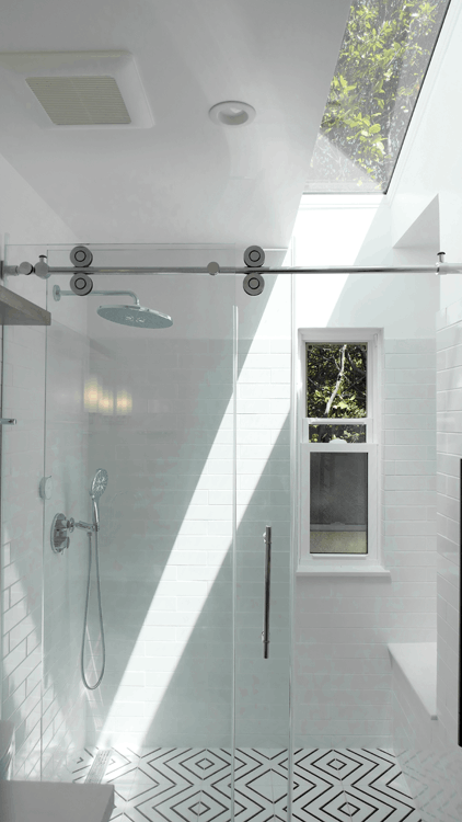
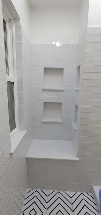
The operable window allows fresh air in and moist air out. The skylight dramatically brings in light and views of the garden and sky. The niches and seat are recessed out of view.
Master Bathroom
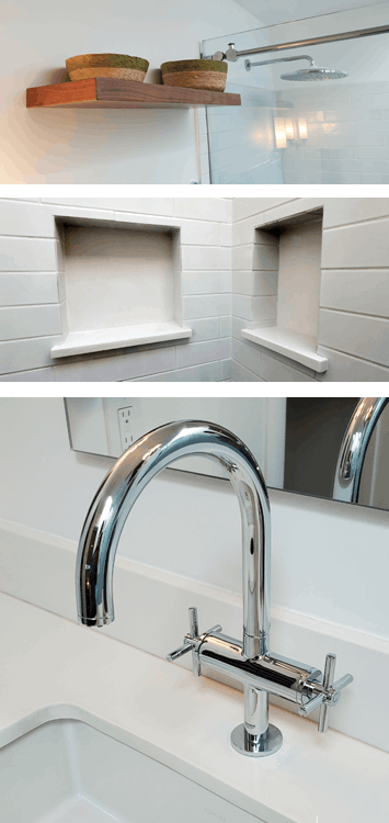
Shampoo, conditioner and other clutter are out of view but still easily accessible. Four deep niches provide ample storage for these items.
Master Bathroom
Thoughtful design is integrated into all details of the bathroom - balancing the practical and the aesthetic .
With little to no storage, the limited counter space was further diminished when the counter was used to store items. Even the top of the refrigerator became an ad hoc storage shelf.
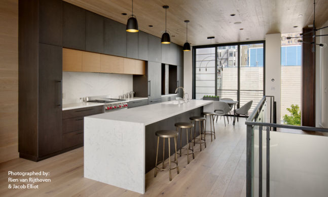
Floor to ceiling cupboard to the left, a pantry to the right, and cabinet space in the island, keep all kitchen items neatly stored away out of sight. Demolishing a small end wall opens this kitchen to the dining area while the range is relocated in the island so the resident can face toward the main space and engage others in the main space.
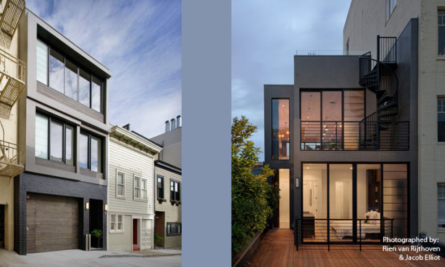
The front and rear of this modern yet contextually influenced residence maximizes interior living space while creating outdoor living spaces in the rear and on the roof.
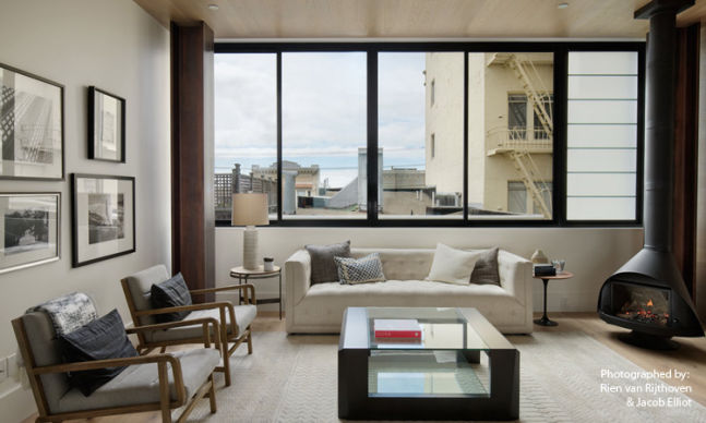
The high ceilings and open plan kitchen/living room allows easy movement, unobstructed light to enter the space and makes the space feel larger.
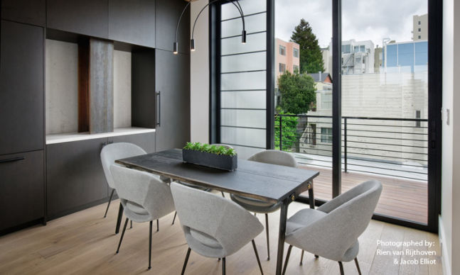
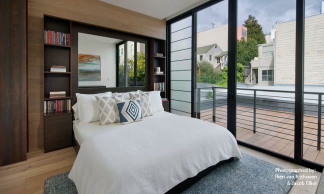
Floor to ceiling window/door allows ample light in, maximizes views out and creates a continuity of the indoor space out to the exterior deck.
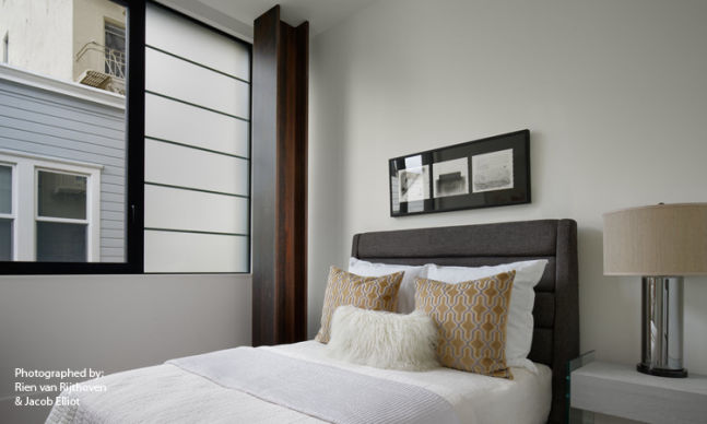
Large windows in all the bedrooms allow for light and bright spaces, even during those foggy San Francisco days.
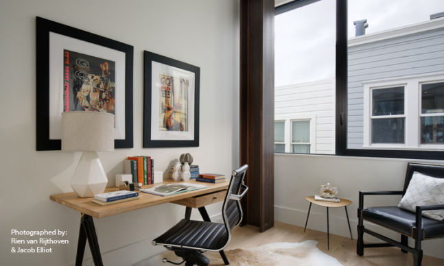
A comfortable home office separate and quiet from the open plan spaces is essential.
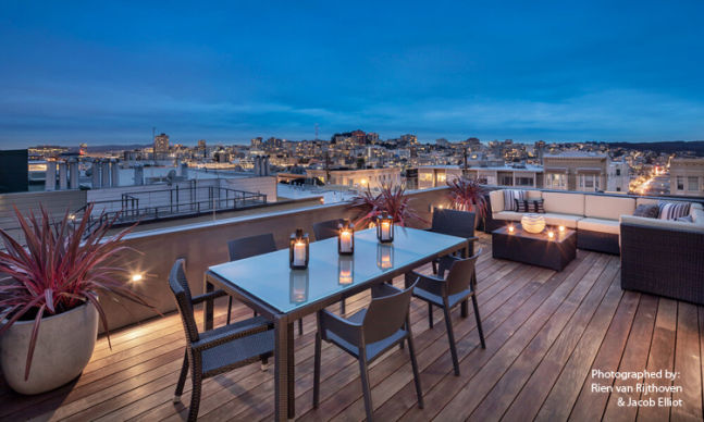
The local Mediterranean climate allows the roof deck to be a perfect location for outdoor living with a stunning view.
Site was designed with Mobirise